


dwelldesigndisruptdwell
India’s fastest-growing insurtech, InsuranceDekho empowers users to compare and select the best policies from 46+ insurers, backed by $150M in recent funding.
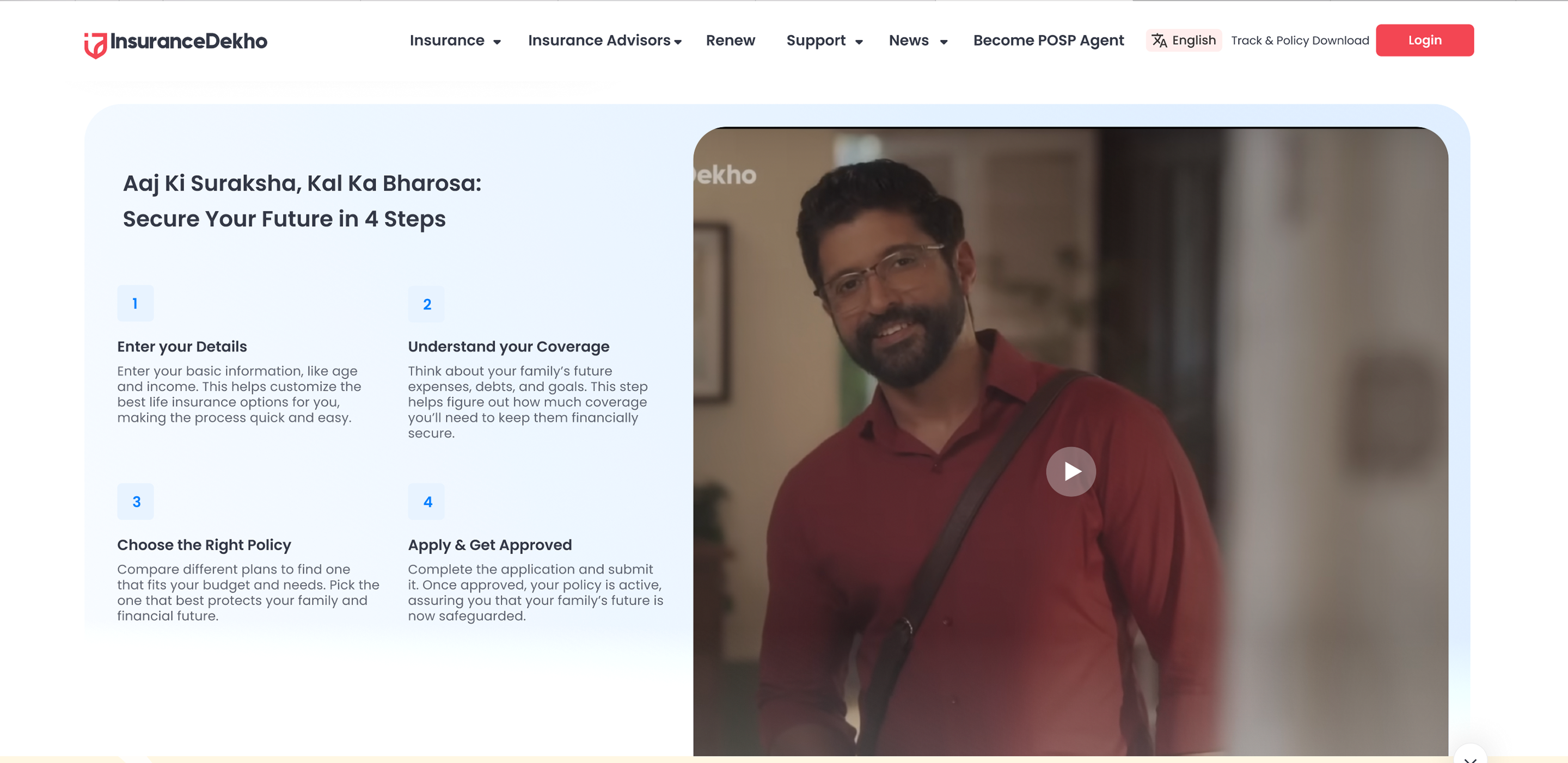
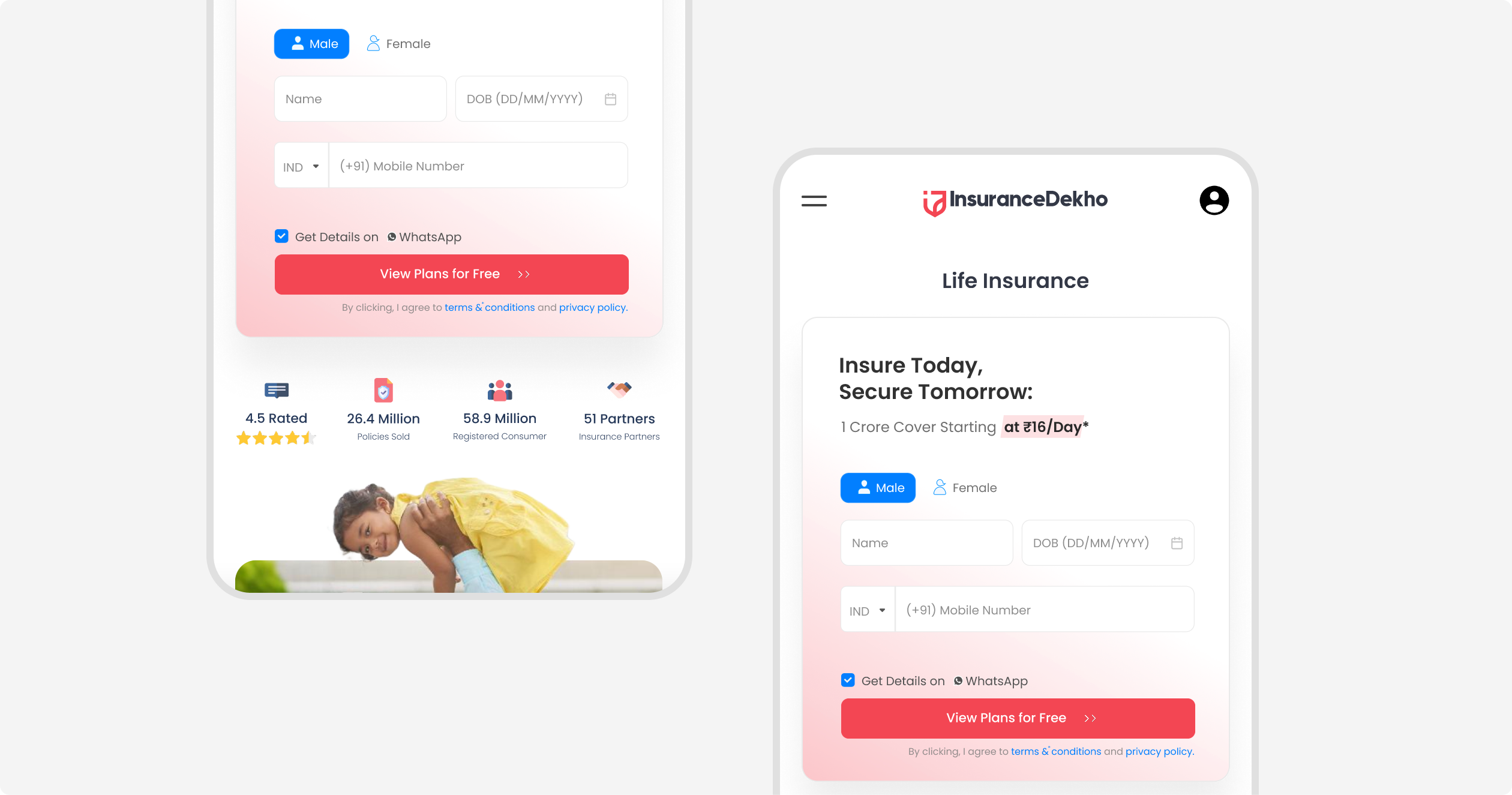
Insurance Dekho wanted to increase conversions on their life insurance landing pages. But the ask wasn’t just about UI tweaks—it was about rethinking how users process trust, intent, and action on a high-stakes decision page.
🔎 Note: This was a vendor evaluation project. The UX concept was designed but not implemented as part of a live engagement.
We profiled real users from ads and search, mapped their information needs, and benchmarked competitors. Our strategy: build trust and clarity before nudging users to act, making conversion a natural next step.
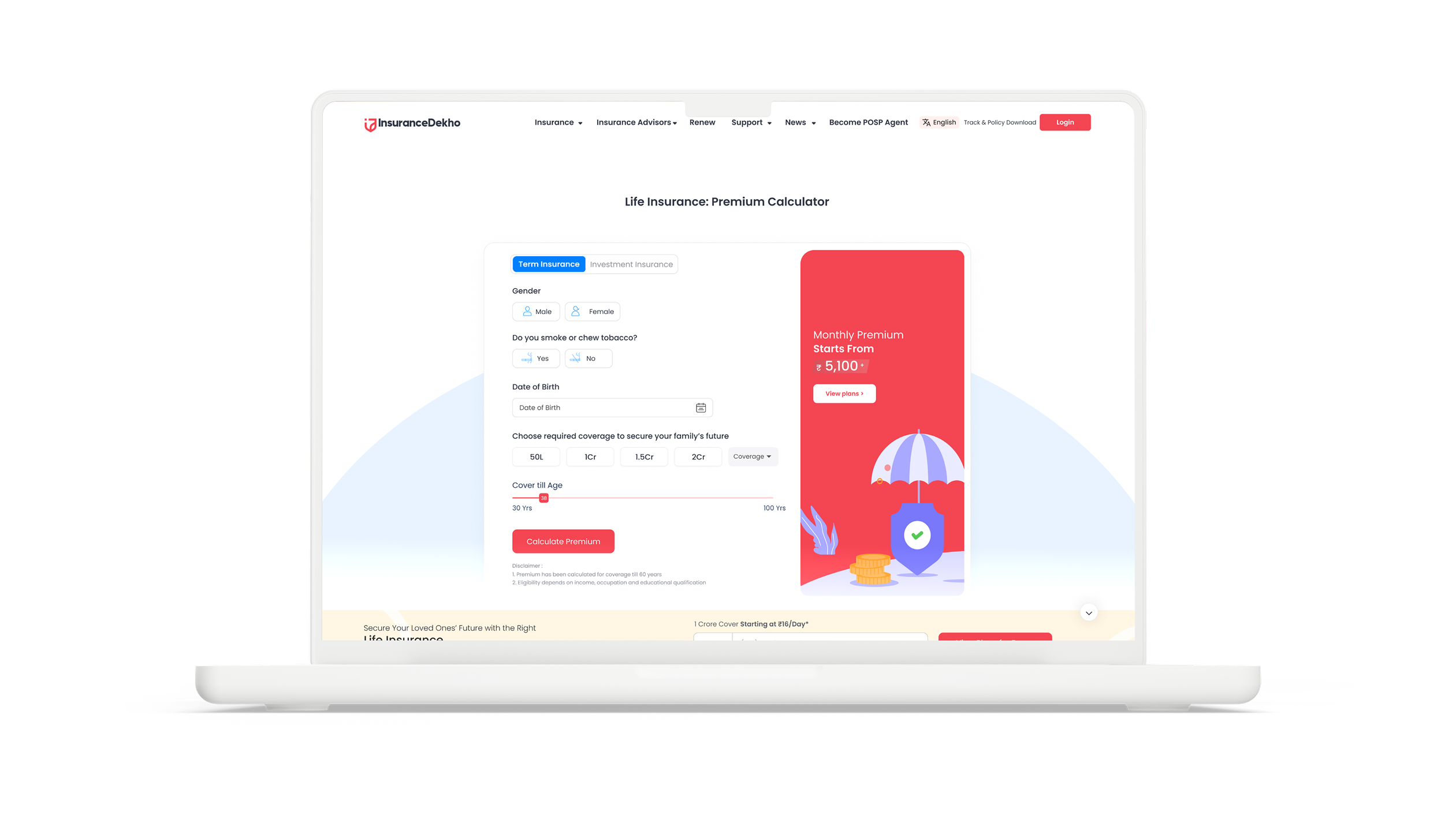
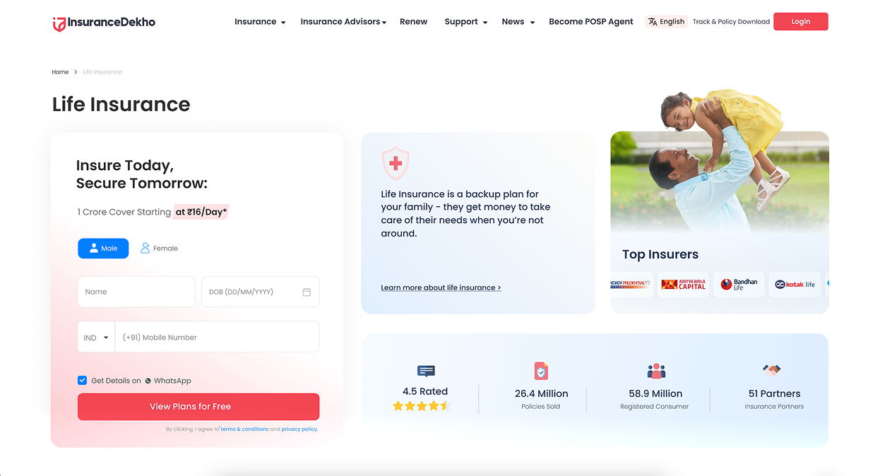
We replaced the cold, form-only hero with a bento grid layout, blending the form with social proof, insurer logos, and credibility stats—inviting users in with reassurance, not pressure.
Recognizing that most users scroll before acting, we introduced a dynamic sticky CTA bar—always accessible, minimally invasive, and appearing the moment the user feels ready.
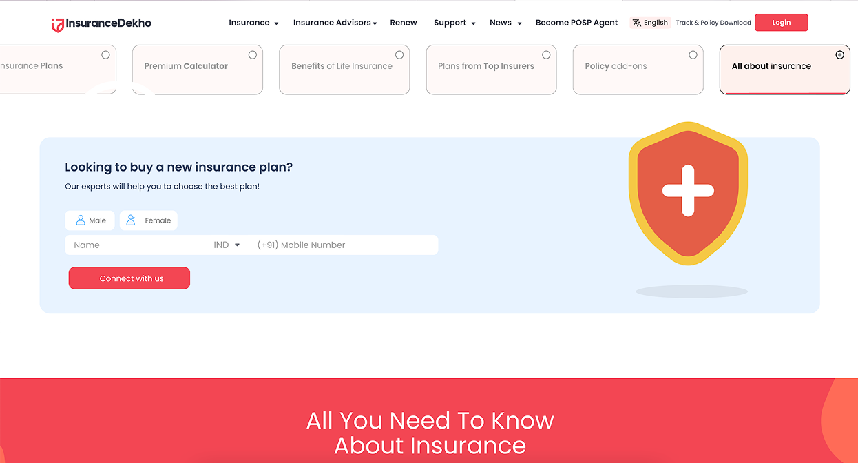
To tackle dense, scattered content, we built a plug-and-play navigation bar grouping 15+ sections into 7 clear categories, letting users jump straight to what matters and reducing cognitive fatigue.
The concept was prototyped with Figma and Protopie, featuring UI screens and before/after comparisons to showcase the transformation.

